Grids are used to break any space into fractions, they can be nested and stacked. A unit can contain another line or it can contain other objects directly. The sum of the fractional sizes of all children of one line should be equal to one. Grids control width, content controls height. The grids have all the functionality of YUI grids and some other important features.
网格用于将行空间等分,这些等分单元可以嵌套和堆叠。一个单元可以继续做行等分,也可以直接包含其他的元素。一行中的所有内容的空间总和应当等于其他一行的空间。网格控制着宽度,内容控制着高度。网格模块包含YUI网格中所有的功能和一些其他重要的特性。
- Less than 1kb! (including full templates and grids)
- Infinite nesting and stacking.
- The only change required to use any of the objects, is to place it in the HTML. No changes to other places in the DOM, and no location dependent styling.
- Easy integration with back-end development.
- Easy for beginners to create complex page layouts.
- 小于1kb!(包含所有的模板和网格)。
- 可以无限地嵌套和堆叠。
- 只需将需要的对象放到HTML中。DOM中其他地方不需要改变,也不会影响定位相关样式。
- 便于后端开发工程师集成。
- 便于初学者创建复杂页面布局。
Please help me test the grids and template objects. Put them through their paces and let me know if you manage to break them!
请帮我测试网格和模板对象。请您测试它们的效果,有任何疑问,请联系我!
Base Classes
| Property | Description |
|---|---|
line |
Groups units on one horizontal line. Note: for mobile layout units may be stacked to avoid horizontal scrolling. |
unit |
Base class which divides a line into sections (columns). |
sizeXofY |
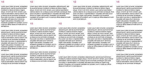
Extends unit. Indicates the fractional width of the unit, for example size3of4 would take up three quarters, or 75%, of the horizontal space. The following fractions are supported: 1, 1/2, 1/3, 2/3, 1/4, 3/4, 1/5, 2/5, 3/5, 4/5 |
lastUnit |
Extends unit. Applied to the last child of every line. |
| 属性 | 描述 |
|---|---|
行(line) |
一组网格单元位于一条水平的行上。注意:对于移动端布局单元来说,网格单元可能会垂直堆积以避免水平滚动。 |
单元(unit) |
单元基类,将一行分为几个部分(列)。 |
sizeXofY |
继承自unit。表明单元的占比宽度,例如,size3of4表示占据整个水平空间的四分之三。支持的分数形式如下:1, 1/2, 1/3, 2/3, 1/4, 3/4, 1/5, 2/5, 3/5, 4/5。 |
最后一个单元(lastUnit) |
继承自unit. 应用于每行中最后一个子元素。 |
Grids possible with OOCSS framework by Stubbornella (aka Nicole), on Flickr
在Flickr上,Stubbornella(又名Nicole)制作的OOCSS框架中网格可能的实现
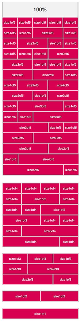
一半(Halves)
1 | <div class="line"> |
三等分(Thirds)
1/3, 1/3, 1/3
1 | <div class="line"> |
1/3, 2/3
1 | <div class="line"> |
四等分(Quarters)
1/4, 1/4, 1/2
1 | <div class="line"> |
3/4, 1/4
1 | <div class="line"> |
五等分(Fifths)
4/5, 1/5
1 | <div class="line"> |
2/5, 3/5
1 | <div class="line"> |
复杂的集合 - AG测试(Complicated Nesting - the AG test)
AG test of a great grids system by Stubbornella (aka Nicole), on Flickr
在Flickr上,由Stubbornella (aka Nicole)设计的基于大型的网格系统的AG测试
Many years ago Arnaud Gueras, an excellent developer I worked with, created this litmus of a great grids system. It should be able to nest any combination of the units and lines, and so it should be able to create the complicated layout below. His test reminded me of the golden mean, so I still use it today.
许多年前,和我一起工作的优秀工程师Arnaud Gueras创建一个完美的网格系统。它应当可以实现聚集所有单元和行的结合,并且可以创建一个复杂的布局结构。他的测试为我提供了这个完美的想法,我一直沿用至今。
1 | <div class="line"> |