03、常见问题(FAQ)

原文

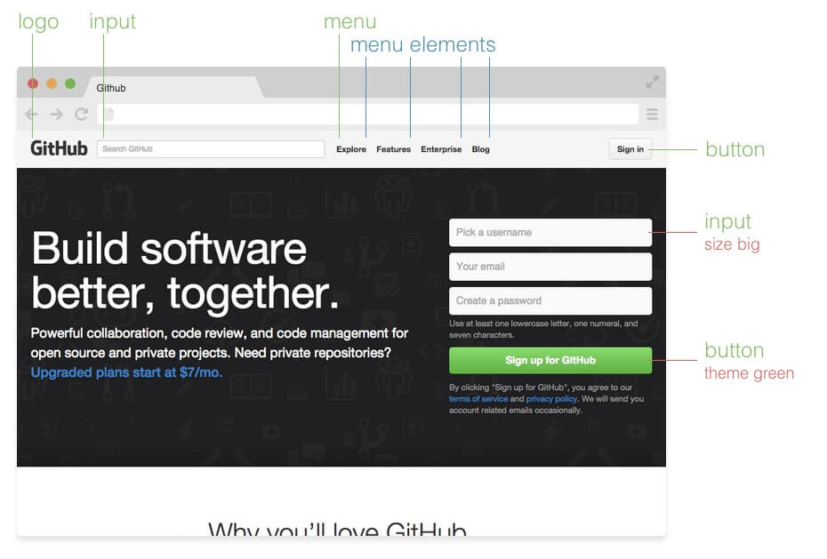
These Frequently Asked Question are real questions of developers started with BEM, answered by the GetBEM community. Feel free to ask your question too, and we will answer it as well.

下面这些常见问题是开始使用BEM的开发人员遇到的真实问题,由GetBEM社区回答。您可以在社区里面随意问问题,我们会在上面回答。

  1. 为什么选择BEM,而不是其他CSS模块方案?(Why should I choose BEM and not another CSS modular solution?)
  2. 为什么不能把修饰符选择器写成组合选择器的形式?(Why are the modifier CSS classes not represented as a combined selector?)
  3. 为什么需要为块设置CSS类而不是使用语义化的自定义标签?(Why do I need CSS classes for block instead of using semantic custom tags?)
  4. 为什么需要组合使用块和块名为前缀的修饰类?(Why do I need to combine block and prefixed modifier class for a modified block?)
  5. 块修饰类可以改变内部元素吗?(Can a block modifier affect elements?)
  6. 可以创建被任何块使用的全局修饰类吗?(Can I create a global modifier applicable to any block?)
  7. 可以在选择器上合用标签和类吗,就像button.button?(Can I combine a tag and a class in selector like button.button?)
  8. 可以将修饰类命名为CSS中对应的样式吗?就像.block__element--border-bottom-5px一样。(Is this good to name modifiers corresponding to what they have in CSS? Like .block__element--border-bottom-5px.)
  9. 如何命名嵌套元素的类名?像.block__el1__el2这样吗?(What would be a class name for an element inside another element? .block__el1__el2?)
  10. 我听说BEM不推荐使用全局CSS重置,为什么?(I’ve heard that BEM does not recommend global CSS resets? Why?)
  11. 没找到答案?(Did not find the answer?)

为什么选择BEM,而不是其他CSS模块方案?(Why should I choose BEM as a modular solution for CSS?)

There are some other modular solutions for CSS (such as OOCSS, AMCSS, SMACSS, SUITCSS). What are the reasons to choose BEM?

现在有许多的CSS模块解决方法(例如OOCSS,AMCSS,SMACSS和SUITCSS)。那为什么要选择BEM呢?

BEM provides solutions for all the frontend technologies: CSS, JavaScript, templating; and also for building process of your web application. The methodology is applicable anywhere. However, to apply this in JavaScript and templating you would need special frameworks whereas in CSS you may just follow the methodological recommendations. The CSS part of BEM is the easiest to take into your development process. This is why many use only it. On the other hand, if lately you would found your project fully BEMed (in CSS) and yourself happy for its grown maintenance, you probably would take next step in modularizing your web application. BEM CSS will be easier to coordinate with modular JavaScript and blocks-based project file structure.

BEM为所有的前端技术提供了解决方案:CSS,JavaScript,模板; 也可以用于构建您的Web应用程序。这种方法适用于任何地方。但是,要在JavaScript和模板中应用BEM,您需要特殊的框架,而在CSS中,您按照建议的方法去做就行。BEM的CSS部分是最容易引入到您的开发流程中的。这就是为什么许多人选择它的原因。另一方面,如果您的项目已经完全实现了实现BEM(在CSS中),并且可以容易的扩展,那您可以利用模块化来完成您的Web应用程序的下一步。BEM CSS易于与模块化的JavaScript和基于块的项目文件结构结合使用,可以让工作变得更轻松。

If speaking about CSS modular solutions only, the key feature of BEM is block’s independence. Following the CSS recommendations enables to put a block into any place on a page and be sure that is won’t be affected by its surroundings. Also, if you would lately need to nest another block into the current one, their full compatibility is guaranteed. In other words, when maintaining your web application you would be able to move blocks across the page, add others and combine them.

如果仅仅谈到CSS模块化的解决方案,BEM的关键特征就是块元素的独立性。根据BEM的CSS建议,一个块可以放置在网页上的任何位置,并确保不会受到周围环境的影响。而且,如果您需要在当前块中嵌套另一个块,会保证两个块的兼容性。换句话说,在维护Web应用程序时,您可以跨页面移动块元素,添加其他块并将其组合起来。

BEM CSS unambiguously defines which CSS belongs to a piece of interface and so using it gives answers to questions “Can I remove this piece of code?” and “What happens and which interface parts will be affected if I change this piece of code?”.

BEM CSS明确定义了哪些CSS属于一个界面,因此使用它可以解决“我可以删除这段代码吗?” 和“如果我更改了这段代码,会发生什么事情?哪些接口部件会受到影响?”的问题。

为什么不能把修饰符选择器写成组合选择器的形式?(Why the modifier CSS classes are not represented as a combined selector?)

BEM recommends to modify blocks like this <div class="block block--mod">. Why not to use the simple version like <div class="block mod">? Since we now have combined selectors .block.mod, it’s easy to define all the CSS properties to it.

BEM推荐像<div class="block block--mod">这样的修饰类。为什么不用简单<div class="block mod">这样的版本呢?使用组合选择器.block.mod,就可以很容易地定义所有CSS属性。

The recommendation to prefix modifier CSS class with its block name has multiple reasons.

使用块名称做修饰符CSS类的前缀有多种原因。

Firstly, since it is possible to mix several blocks and elements at the same DOM node, we need to ensure that a modifier would affect only the block it belongs to. Let’s say that we have a menu item element and a button mixed together. In HTML this construction is represented
by the following markup:

首先,由于我们可以在同一个DOM节点上添加多个块和元素的类,所以需要确保修饰符只影响它所属的块元素。假设我们将一个菜单项的元素和一个按钮混合在一起。在HTML中,这种结构会是这样的:

1
<div class="menu__item button"></div>

In this case adding .active modifier to them would affect both.

在这个例子中添加修饰符.active会对它们俩都产生影响。

1
<div class="menu__item button active"></div>

All the 3 sit at the same DOM node, so it is impossible to differentiate if we mean menu__item.active or button.active. Whereas in the prefixed case the naming button--active unambiguously says as that this is only the button that has to be affected.

所有的3个类都在同一个DOM节点上,所以如果我们用menu__item.active或者button.active无法区分出它们。而在有前缀button--active的情况下 - 可以毫不含糊地说,当前元素是唯一会被影响的按钮。

Another point is CSS specificity. The combined selectors are more specific (means more important) than single class selectors. This means that you might have trouble when redefining them with parent block code.

另一点是CSS的特殊性。组合的选择器比单个选择器更具体(意味权重更高)。这意味着在用它们父节点块的代码重新定义它们时可能会遇到麻烦。

1
2
3
<div class="header">
<button class="button active">
</div>

If you already have .button.active selector in your code, the specificity of your redefining .header .button would be exactly the same as the specificity of modifier combined selector which makes you dependent on the order of the CSS rules declared. Whereas if you use a prefixed modifier, you can always be sure that the cascade selector .header .button will overwrite the .button--active modifier.

如果在您的代码中已经添加了.button.active选择器,那么重新定义.header .button的独特性与修饰符组合选择器的独特性完全相同,这使得最后的效果会依赖于您声明的CSS规则的顺序。而如果使用前缀修饰符,则始终可以确保级联选择器.header .button将覆盖.button-active修饰符的样式。

This makes life easier especially for maintainable projects.

这更有利于项目的可维护性。

The third point is that looking at the <div class="block block--mod"> markup you can clearly see the block structure. It is easy to recognize that we have a block and its modifier and there is no different interpretations here. Unfortunately a grasp onto <div class="block mod"> code does not give such information. Depending on what are the exact CSS classes sometimes it is impossible to recognize if we have a block and a modifier or a mix of 2 blocks here. This might be even more confusing if the names of the entities are complex or contracted/abbreviated (which sometimes happens in big projects).
Clear understanding of a block structure is especially helpful when looking for corresponding code on a file system.

第三点是当您看看<div class =“block block-mod”>标记时,您可以清楚地看到块结构。我们很容易看到,此处我们有一个块元素和它的修饰符,这是确定的。不幸的是,使用<div class =“block mod”>代码并不能提供这样信息。如果依靠确切的CSS类,有时可能辨别不出我们是由一个块元素,还是一个修饰符或是2者的混合。 如果实体的名称是复杂的或是缩写的(这在大项目中有时会发生),情况可能会更加糟糕。

You will also appreciate .block--mod practice when refactoring and use global search over all your project files. Imagine the same looking for not-prefixed .mod and all the HTML pieces it might be in.

当重构和使用全局搜索您的所有项目文件时,您也许会喜欢使用.block--mod这样的方法。可以想象一下,如果.mod和其他HTML代码没有前缀,情况又是什么样的。

And lastly, from a development process standpoint the difference between .block.mod and .block--mod is only one symbol. Using - instead of . costs nothing but it brings all the benefits listed above. Moreover, since pre-processor began to support BEM notation, it is pretty natural to write &--mod there and finally get a modifier declared as it was recommended.

最后,从开发过程的角度来看,.block.mod.block--mod之间的区别只是一个符号。 使用- 而不是. 不会花费任何东西,但它会带来上面列出的所有好处。而且,由于预处理器开始支持BEM的声明,所以在那里编写&--mod是很自然的,最后,您会得到一个推荐的修饰符。

为什么需要为块设置CSS类而不是使用语义化的自定义标签?(Why do I need CSS classes for block instead of using semantic custom tags?)

Blocks can be represented as custom tags which we may define CSS rules for. Looks like we do not need CSS classes for blocks at all. They can be used for modifiers only, like <button class="mod"/>.

块是可以是自定义标签,并为其定义CSS规则。所以看起来根本不需要CSS类的块,只需要(在语义化的标签上)使用修饰符即可,如<button class =“mod”/>

Using custom tags as block selectors is indeed one of the BEMish solutions and can be used. However this variant is less flexible than the recommended “class” approach.

确实存在使用自定义标签作为块选择器的解决方案,BEMish就是其中可用的方案之一。但是,相比这种形式,推荐的“class”形式要更灵活。

This is more likely that you would need to prefix modifier classes with their block name to provide them namespace. The details are uncovered in “Why the modifier CSS classes are prefixed with their parent block name?” question. So, finally the custom-tag version of a block is like <block class="block--mod"/>. This does not look very different from <div class="block block--mod"> especially assuming that being tag-independent you can use any custom node and stay with <block class="block block--mod">.

需要考虑的情况是,块名称作为前缀为修饰符类提供命名空间。详细情况已在“为什么不能把修饰符选择器写成组合选择器的形式?”中说明。所以,自定义标签块的形式最终是<block class =“block-mod”/>。假设自定义节点和标签不关联,那么<block class =“block block-mod”><div class =“block block-mod”>看起来没什么两样。

Second drawback is that “tag” version makes using the mixes of blocks impossible whereas the “class” version represent that naturally by <div class="block1 block2">.

第二个缺点是“标签”的版本使得混用块是不可能的,而“class”的版本用<div class =“block1 block2”>自然地表示。

And the last clench against such an approach is that in many cases you are not able to represent your blocks with custom tags at all. For a link block you definitely need <a> tag, and the same for <input>.

最后一个原因是在很多情况下,块不能用自定义标签来表示。对于link块,您肯定需要<a>标签,对于<input>标签也是如此。

为什么需要组合使用块和块名为前缀的修饰类?(Why do I need to combine block and prefixed modifier class for a modified block?)

Why does both block’s and modifier’s class sit together in the modified block like <div class=”block block--mod”>?

Everything about a modified block can be described in .block--mod. If there is something common between 2 modifiers, it’s possible to use preprocessor’s mixins to avoid copy-paste.

为什么块和修饰类要在一起使用,比如<div class =“block block--mod”>

直接使用修饰类.block--mod来描述更简单。如果两个修饰类之间有共同之处,可以使用预处理器的mixin来避免重复。

This approach is possible thanks to preprocessors. However it brings some drawbacks which you should be aware of.

使用预处理器确实可以解决这个问题,但这样做存在一些需要考虑的缺点。

In the case of combining 2 or more modifiers at the same block <div class="block--theme--christmas block--size--big">, you would get the core block’s styles twice. However this depends on the preprocessor algorithms.

比如在同一个块<div class =“block--theme--christmas block--size--big”>中使用两个或更多修饰类,基础块的样式会被引用两次。但这不是绝对的,这取决于预处理器的算法。

When adding/removing modifiers dynamically with JavaScript, the additional modifier is more handy. Switching it off would mean only removing one CSS class from the DOM node with no need to add the core block CSS class back as it sits there forever.

另外当用JavaScript动态添加或移除修饰类时,添加修饰类的操作更方便。将其从DOM节点中删除也不需要考虑基础块——基础块会一直存在。

块修饰类可以改变内部元素吗?(Can a block modifier affect elements?)

If I have a block modifier, for example xmas, and I want the elements within that block to also be xmas themed, how would it be best to do it.

Does a --xmas suffix for every element seem necessary? Or would this be the one use-case for nesting (e.g. block--xmasblock__elem { ... }?)

假如一个块修饰类xmas,并且希望块中的元素也是xmas主题,这种情况怎么处理最好呢?

是否需要为每个元素都添加--xmas后缀?或者这个案例中使用嵌套合适吗?(例如block-xmas block__elem {...}?)

While in general BEM recommends avoiding nested selectors, in this case they are reasonable.

通常情况下,BEM不建议使用嵌套选择器,但是在这个案例中可以使用。

When creating the nested selector, you declare that one entity depends on another. Because BEM introduces independent components, such an approach is not suggested when we are speaking about 2 different blocks.

在创建嵌套选择器时,定义一个实体依赖于另一个实体。因为BEM中引入了独立组件,所以2个不同的块元素中,并不建议这样使用。

But when it comes to a block and its element, they are not of equivalent meaning. By definition, an element does not make any sense outside its parent block. So, an element is a block-dependent entity. Assuming this, it is quite normal and logical that an element is affected by the block’s current state.

但是,在一个块和其内部的元素时,另当别论。 根据定义,一个元素若在其父块之外,它就没有任何意义。 所以,元素是依赖块的实体。基于这个假设,一个元素受到当前块状态的影响是很正常的,也是很合乎逻辑的。

So, this is a common pattern in BEM to code

所以,这种情况下BEM代码的通用格式如下:

1
2
3
.my-block--xmas .my-block__button {
/* Jingle bells, jingle bells, jingle all the way.*/
}

可以创建被任何块使用的全局修饰类吗?(Can I create a global modifier applicable to any block?)

I’ve heard that global modifiers like visible, invisible, red, opacity50 are not welcomed in BEM. Why?

I think it is useful to incorporate common properties like this in such a global class and then apply it to different blocks.

听说在BEM中不建议使用visible, invisible, red, opacity50这样的全局修饰类。为什么呢?

我认为将上述这样的常见通用类设置为全局类,然后将其应用到不同的块中是有益的。

Indeed you can have 2 main CSS classes at the same DOM node. In BEM we call it mix:

确实,在同一个DOM节点上可以有两个主要的CSS类,在BEM中我们称之为mix

1
<div class="block1 block2"></div>

But the important thing about it is that both block1 and block2 should be standalone blocks. This is slightly different from what people usually mean by “global modifiers”, as modifiers do not have any sense on their own and are just a set of properties to change.

但是,重要的是block1block2都应该是独立的块。这与人们通常所说的“全局修饰类”的含义略有不同,因为修饰类本身没有任何意义,它们只是表示一组需要改变的属性。

1
<div class="block globalmod"></div>

If you think that in your case you would have a global modifier, these are the problems you may face:

如果您认为在项目中需要用到全局修饰符,那么可能遇到如下问题:

First of all the specificity problem appears. In a local modifier case CSS code goes like this:

首先是特指性问题。在使用本地修饰类的情况下,CSS代码如下所示:

1
2
3
4
5
6
.block {
display: block;
}
.block--hidden {
display: none;
}

Both block and modifier selectors have the same specificity. As modifier declaration goes after the block, it redefines the CSS properties. These styles belong to block and are stored in the block file. Thus, independently on how the resultant CSS is built from source, you will always have them in this order and be sure that redefining happens.

块和修饰选择器具有相同的特指性。由于修饰类是在块声明之后声明的,所有它会重新定义CSS属性。属于块元素的样式会在对应块的文件中存储。因此,构建需要保证CSS的顺序,得到覆盖后重新定义的CSS。

In the case of global modifier, its properties can be redefined by the blocks if they follow modifiers in code:

在全局修饰类的例子中,如果代码中块CSS声明的位置在修饰类声明的后面的话,那么会导致属性由块重新定义:

1
2
3
.hidden { display: none }
/* ... */
.block { display: block }
1
<div class="block hidden">you still see me</div>

One of the possible solutions to this problem is to raise the selector specificity of global modifiers by adding !important to them. But in this case any side-effects of such a global modifier might be overwritten only by declarations with the same !important instruction.

一个常见的解决方案是通过增加!important来提高全局修饰类选择器的特指性。但会造成一定的副作用,全局修饰符只能被同样具有!important的声明覆盖。

Another way is to load global modifier CSS after all the other styles. But in this case you are not able any more to use lazy loading strategy for your components. The additional lazy CSS will still be loaded after the modifiers and you get the same problem.

另一种方案是在所有样式声明之后再加载全局修饰符。但是这种情况下不允许组件使用延迟加载。若您这样使用的话,延迟加载的CSS会覆盖最后声明的修饰类的样式,那您又会遇到相同的问题。

The next problem is combination of several global modifiers at the same block.

接下来的问题是在同一个块中组合使用几个全局修饰符。

1
<div class="block mod1 mod2"></div>

In this case you absolutely have no control over the block. The order of modifiers in code can be different. If it conflicts with other declarations, changing the order can fix this conflict but lead to another one. The only way would be to redefine the mess in block. And don’t forget about the !important to your hack.

因为代码中修饰类的顺序可能不同,所以无法完全控制该块的样式。如果其中一个修饰符与其他的声明冲突,在改变顺序后,虽然可以解决这个冲突,但又导致其他的冲突。对于这个问题,唯一的办法是重新定义这些样式。记得不要忘记使用!important

Also, depending on a block the same modifier can be implemented differently. Even the simple .hidden sometimes needs to be not display: none but visibility: hidden or even position: absolute; left: -9999px etc. And if you need to bring some changes into your block, it is much nicer not to waste time searching for all the places where this block can be combined with a global modifier. Especially assuming that such dependencies usually are not described anywhere.

而且,相同的修饰符在不同的块元素上可以有不同的样式。 即使是简单的.hidden有时使用display: none有时使用visibility: hidden,甚至使用position: absolute; left: -9999px等等。如果想要在您的块中加入一些变化,不用浪费时间去寻找整个块中所有可以和全局修饰符结合的地方。特别是这种依赖关系并不明晰。

All this hell can be avoided by encapsulating a modifier in a block like .block--mod.

所有这一切问题都可以通过把修饰类封装在块中(如.block--mod)来避免。

Indeed using global modifiers makes the resultant code less. However if you measure the real difference in bytes it usually does not seem that big. Especially if you are using CSS optimizer which can combine selectors.

当然,使用全局修饰符会使最后生成的代码量更少。但是,用字节数来衡量实际的差异通常并不大,而且可以使用组合CSS选择器的方式来优化。

可以在选择器上合用标签和类吗,就像button.button?(Can I combine a tag and a class in selector like button.button?)

I want to use selectors like button.button to encapsulate my blocks functionality within a particular tag. If lately someone else would use in their code <h2 class="button">, such an encapsulation would prevent a conflict.

我想使用button.button形式的选择器,将功能块封装进特定标签中。来避免<h2 class =“button”>之类的错误使用。

The CSS specificity of such a selector grows. .button--mod selector will not overwrite CSS properties of the block, only button.button--mod would work. You will need its modifiers to be combined with the tag as well and so do the developers who lately would redefine your block.

由于CSS特指性的增加,简单的使用.button--mod选择器并不能覆盖块的CSS属性,只有使用button.button--mod才能工作。必须将其修饰类与标签结合使用,重新定义块也需要与标签结合使用。

Lately, when a project goes larger, it’s very likely that you may have input.button, span.button and a.button as well. And all the prefixed selectors for modifiers and nested elements will need 4 declarations.

渐渐地,随着项目变大逐渐变大,很有可能会出现input.buttonspan.buttona.button等选择器。所有修饰类和嵌套元素类的前缀选择器都需要4个声明。

So, it is better not to tie your own hands with such prefixing. However if you still can softly-softly ensure that your blocks are used with proper tags if your provide your users with templates for every block. This is the most flexible and automatic solution.

所以,最好不要被这样的前缀束缚。可以提供块对应的样板,以帮助工程师正确的使用。这是最灵活,也最方便的解决方案。

If the templating looks overhead, there is a “documentation” approach to inform your users which tag the block CSS class would be applied to, this can be done with documenting the block code. The shortest version could be just a comment with a tag name prefixing the block declaration /*button*/.button. Or that can be a larger comment with full HTML piece needed to the block to function.

如果模板做起来太过复杂的话,那么可以使用“文档”的方法来告诉工程师哪个块的CSS类适用于哪个标签,这些都可以通过在块的代码中记录完成。最简单的方式只需要在声明代码/*button*/.button前面加上标签名即可。或者,写一段完整的HTML代码块来注释。

可以将修饰类命名为CSS中对应的样式吗?(Is this good to name modifiers corresponding to what they have in CSS?)

Thanks to mixes, we can create a lot of modifiers which represent CSS properties and assign them to blocks. But I’ve heard that “it is bad”. For example, this selector .block__element--border-bottom-5px was stamped as “awful”. I am wondering why and how should the modifiers be named then?

多亏了混合(mixes),可以创建很多代表CSS属性的修饰类,并将它们分配给块元素。但是我听说“这样做很糟糕”。例如,选择器.block_element--border-bottom-5px被打上了“糟糕”的名号。我想知道这是为什么,那我们又应该如何命名修饰类呢?

Naming the modifiers corresponding to their CSS representation is not recommended. Indeed it looks not very nice but there are also practical reasons against it. Lately then the view of your components is changed, you will need to fix not only CSS but also the selectors. So, when you border is 6px, it would require changes in all the templates and sometimes in JavaScript.

不推荐将修饰类命名为CSS中对应的样式。不止是看起来不友好,使用起来也不合理。比如改变组件的视图边框为6px,那不止要修改CSS,还要修改选择器,还要修改所有的模板和JavaScript中的引用。

Also, it never happens that a modifier has only one CSS property to define and will have it forever. Even if now it is only border that differentiates one state from another, this is very likely that lately you would need other CSS properties for the same state of your block. This would be messy if you define a background or padding in a modifier called “border”. So, it is recommended to choose semantic names for modifiers even if they only have one property by now.

另外,从来没有过只为一个CSS属性声明修饰类。即使现在两个类只是边框不同,之后也很有可能需要修改这个类中的其他CSS属性。 比如在“border”的修饰符类中定义背景或内边距的样式,这看起来会很奇怪。所以,即使现在只有一个属性,也建议选择使用语义来定义修饰类。

如何命名嵌套元素的类名?像.block__el1__el2这样吗?(What would be a class name for an element inside another element? .block__el1__el2)?

What should I do if my block has a complex structure and its elements are nested? CSS classes like block__elem1__elem2__elem3 look scary.

如果一个块的结构复杂,子元素存在嵌套,应该如何处理它们?如果将CSS类命名为block__elem1__elem2__elem3,那看起来也太可怕了。

According to BEM method, block structure should be flattened; you do not need to reflect nested DOM structure of the block. So, the class names for this case would be:

根据BEM的方法,块元素的结构应该是平整的; 不需要反映该块是嵌套DOM结构。所以,这个例子的类名是:

1
2
3
4
.block {}
.block__elem1 {}
.block__elem2 {}
.block__elem3 {}

Whereas the DOM representation of the block may be nested:

嵌套的DOM结构可以如下表示:

1
2
3
4
5
6
7
<div class='block'>
<div class='block__elem1'>
<div class='block__elem2'>
<div class='block__elem3'></div>
</div>
</div>
</div>

Besides the fact that the classes look much nicer, it makes the elements be dependent on the block only. So, you can easily move them across the block when providing changes to the interface. The changes of the block DOM structure would not need corresponding changes to the CSS code.

除了让类的结构看起来更好之外,它还使得子元素只依赖于块元素本身。所以,当对UI进行更改时,您可以轻松地对它们进行操作。而且,对于块DOM结构的变化,不需要对CSS代码做相应的改变。

1
2
3
4
5
6
<div class='block'>
<div class='block__elem1'>
<div class='block__elem2'></div>
</div>
<div class='block__elem3'></div>
</div>

我听说BEM不推荐使用全局CSS重置,为什么?(I’ve heard that BEM does not recommend global CSS resets. Why?)

CSS resets is a practise making a good showing. Many frameworks first align anything and then apply their special styles. BEM does not recommend common resets. Why? And what we are supposed to do instead?

CSS重置是一种表现良好的实践。许多框架会首先使用它将所有元素重置,然后再应用特殊样式。为什么BEM不推荐这种常见的重置?那我们应该如何做呢?

Nothing bad would happen to your blocks if you use common reset (well, except of some special cases below). So, BEM does not prohibit to use them. But using them BEM-way would be more effective.

如果你正在使用常见的重置,不会对块产生不良的影响(除了下面的一些特殊情况)。所以,BEM并不禁止使用它们。但是,使用BEM的方式会更有效。

Common CSS reset is a set of CSS to be applied to document nodes and ensure that their default view is the same in different browsers. In most cases the CSS rules are written for tag selectors and this is not recommended in BEM (you can find a lot of explanation above).

常见的CSS重置是一组应用到文档节点的CSS,并确保它们在不同的浏览器中的默认视图保持一致,在这种数情况下,CSS规则是为标签选择器编写的,在BEM中不推荐(在上面可以找到很多解释)。

Another point is that in BEM a block encapsulates everything which is needed for it to be displayed and function. And this is why we call the BEM blocks independent. If the block does not look properly without a third-party CSS being added onto the page, it cannot be called “independent” that much.

另一个原因是,在BEM中,一个块会封装所需的所有功能,这就是我们称BEM为独立模块的原因。 如果块的展示依赖于第三方CSS,就不能称这个块为“独立”的块。

Assuming this all, BEM recommends every block to reset itself. If you have menu block and list block both as <ul> in your HTML, each of them should provide the reset CSS usually given to <ul>. You may worry that having several blocks with the same reset rules will case repeats in the resultant code. But this is what CSS optimizers should do for you. As a developer you develop every block independently, as if there are no other blocks on the same page.

除此之外,BEM还建议每个块可以重置其本身。如果在您的HTML中menu块和list块都是<ul>,那么两者都应该为<ul>提供复位的CSS。您可能会担心,具有相同重置规则的多个块会在结果代码中重复出现。但这是CSS优化器应该做的。作为开发人员,应该独立开发每个模块,就好像在同一页面上没有其他模块一样。

In the case you don’t have a CSS optimizer to combine selectors with the same set of rules, you may use preprocessors to prevent copy-paste. With every new block you can make it reset itself mixing the proper code. For example, with SASS this would look like:

上面这种情况中,如果没有合适的合并CSS不同选择器中相同规则的方式,可以使用预处理器来避免复制粘贴。可以在添加新块后,插入重置代码以保证最后可以生成正确的代码。例如,在SASS中,看起来就像:

1
2
3
4
5
6
7
8
9
10
11
12
13
14
15
.menu {
@include reset-list;
}
.menu__item {
@include reset-list-item;
}

/* ... */

.list {
@include reset-list;
}
.list__item {
@include reset-list-item;
}

However using this mixin-way you should realize that the only reason for it is not having a proper optimizer.

注意,您需要意识到,这里面使用混合方式的唯一原因是现在没有合适的优化器。

Having resets for every block (besides being nice and BEMish) will also prevent problems with injecting a third-party piece of HTML/CSS markup which relies on browser defaults and so can be affected by global resets. For example, this is a known problem for webmails.

重设每个块元素(除了好看和BEM范儿之外),也可以防止页面中注入第三方HTML/CSS后,对全局样式造成的影响。例如,在网络邮件中,是一个已经存在的问题。

没找到答案?请直接提问!(Did not find the answer? Please ask your questions!)

If you didn’t find the proper answer, please ask your question!

如果您没有找到合适的答案,请直接提问

02、命名(Naming)

原文

There are only two hard problems in Computer Science: cache invalidation and naming things — Phil Karlton

计算机科学中有两个最难的问题:缓存失效和命名 - Phil Karlton

It is a known fact that the right styleguide can significantly increase development speed, debugging, and the implementation of new features in legacy code. Sadly, most CSS codebases are sometimes developed without any structure or naming conventions. This leads to an unmaintainable CSS codebase in the long term.

一个众所周知的事实:正确的编码风格可以显著地提高开发、调试以及在遗留代码添加新功能的速度。令人遗憾的是,大多数CSS代码库是在没有任何结构约定或命名约定的情况下开发的。这种导致了CSS代码库长期不可维护。

The BEM approach ensures that everyone who participates in the development of a website works with a single codebase and speaks the same language. Using proper naming will prepare you for the changes in design of the website.

BEM的方法确保参与网站开发的每个人都可以使用单一的代码库,并使用共同的语言进行开发。同时为将来网站的变化提供了适当的命名规范。

块(Block)

Encapsulates a standalone entity that is meaningful on its own. While blocks can be nested and interact with each other, semantically they remain equal; there is no precedence or hierarchy. Holistic entities without DOM representation (such as controllers or models) can be blocks as well.

块是封装为一个独立有意义的实体。虽然块可以相互嵌套和交互,但是在语义上,它们是平等的,没有优先级或层级区分。注意,即使没有DOM的完整实体(如控制器或模型)也可以是一个块。

命名(Naming)

Block names may consist of Latin letters, digits, and dashes. To form a CSS class, add a short prefix for namespacing: .block

块的命名可以包括拉丁字母,数字和中横线组成。为了构成一个CSS类,需要在命名空间上添加一个简短的前缀.block

HTML

Any DOM node can be a block if it accepts a class name.

任何DOM节点如何可以接收到一个类名,都可以成为一个块元素。

1
<div class="block">...</div>
CSS
  • Use class name selector only
  • No tag name or ids
  • No dependency on other blocks/elements on a page
  • 仅使用类选择器
  • 不包含标签名称或ID
  • 不依赖页面上的其他块/元素
1
.block { color: #042; }

元素(Element)

Parts of a block and have no standalone meaning. Any element is semantically tied to its block.

元素是块的组成部分,没有独立的意义,并且在语义上与它对应的块关联。

命名(Naming)

Element names may consist of Latin letters, digits, dashes and underscores. CSS class is formed as block name plus two underscores plus element name: .block__elem

元素名称可以由拉丁字母,数字,中横线和下划线组成。CSS类可以在块名称后加上两个下划线再加上元素名称:.block__elem

HTML

Any DOM node within a block can be an element. Within a given block, all elements are semantically equal.

块中的任何DOM节点都可以看做一个元素。在一个块中的所有的元素在语义上相等。

1
2
3
4
<div class="block">
...
<span class="block__elem"></span>
</div>
CSS
  • Use class name selector only
  • No tag name or ids
  • No dependency on other blocks/elements on a page
  • 仅使用类选择器
  • 不包含标签名称或ID
  • 不依赖页面上的其他块/元素

好的范例(Good)

1
.block__elem { color: #042; }

不好的范例(Bad)

1
2
.block .block__elem { color: #042; }
div.block__elem { color: #042; }

修饰符(Modifier)

Flags on blocks or elements. Use them to change appearance, behavior or state.

块或元素的标记。可以使用它们来改变块或元素的样式、行为或状态。

命名(Naming)

Modifier names may consist of Latin letters, digits, dashes and underscores. CSS class is formed as block’s or element’s name plus two dashes: .block--mod or .block__elem--modand .block--color-blackwith .block--color-red. Spaces in complicated modifiers are replaced by dash.

修饰符的名称可以由拉丁字母,数字,中横线和下划线组成。CSS类可以由块或元素的名称加上两个中横线组成:.block--mod.block__elem --mod.block--color-black.block--color--red。复杂修饰符中的空格被短划线所取代。

HTML

Modifier is an extra class name which you add to a block/element DOM node. Add modifier classes only to blocks/elements they modify, and keep the original class:

修饰符是添加到块/元素DOM节点的额外类的名称。我们只将修饰符类添加到修改过的块/元素,并保留它们原始的类:

好的范例(Good)

1
2
<div class="block block--mod">...</div>
<div class="block block--size-big block--shadow-yes">...</div>

不好的范例(Bad)

1
<div class="block--mod">...</div>
CSS

Use modifier class name as selector:

使用修饰符的类名作为选择器:

1
.block--hidden { }

To alter elements based on a block-level modifier:

若要基于块级修改器来更改元素,请执行以下操作:

1
.block--mod .block__elem { }

Element modifier:

元素修饰符:

1
.block__elem--mod { }

范例(Example)

Suppose you have block form with modifiers theme: "xmas" and simple: true and with elements input and submit, and element submit with its own modifier disabled: truefor not submitting form while it is not filled:

在此,假设您有以下修饰符的块:theme: "xmas"simple: true,并且有元素inputsubmit,同时元素submit有本身为那些在没有填充时不显示的修饰符disabled:true时代码如下:

HTML
1
2
3
4
<form class="form form--theme-xmas form--simple">
<input class="form__input" type="text" />
<input class="form__submit form__submit--disabled" type="submit" />
</form>
CSS
1
2
3
4
5
6
.form { }
.form--theme-xmas { }
.form--simple { }
.form__input { }
.form__submit { }
.form__submit--disabled { }

01、介绍(Introduction)

原文

On smaller brochure sites, how you organize your styles isn’t usually a big concern. You get in there, write some CSS, or maybe even some SASS. You compile it all into a single stylesheet with SASS’s production settings, and then you aggregate it to get all the stylesheets from modules into a nice tidy package.

在小型网站上,设计网站的样式表通常问题不大。这种情况下,写一些CSS,或一些SASS就可以实现想要的效果。使用SASS的生产配置编译,将相关的样式表合到一个压缩后的文件中即可。

However, when it comes to larger, more complex projects, how you organize your code is the key to efficiency in at least these three ways: it affects how long it takes you to write code, how much of that code you’ll have to write and how much loading your browser will have to do. This becomes especially important when you’re working with teams of themers, and when high performance is essential.

但是,当网站变得更大,项目更复杂时,需要从3个关键细节思考如何有效地组织代码:编写代码的时间、编写代码的数量和浏览器加载的大小。在团队合作中这3点会更重要,同时必须考虑代码的性能。

This is also true for long-term projects with legacy code (read “How to Scale and Maintain Legacy CSS with Sass and SMACSS” — some nice SMACSS and BEM mixing in there).

对于项目中的历史遗留代码也是如此(请参阅“如何使用Sass和SMACSS来扩展和维护历史遗留的CSS代码” - 里面包含一些混合使用SMACSS和BEM的优秀案例)。

方法(Methodologies)

There are plenty of methodologies out there aiming to reduce the CSS footprint, organize cooperation among programmers and maintain large CSS codebases. This is obvious in large projects like Twitter, Facebook and Github, but other projects often grow into some “Huge CSS file” state pretty quickly.

目前有很多方法可以减少CSS的体积,处理工程师的合作问题以及维护大型的CSS代码库。这在Twitter,Facebook和Github等公司的大型项目上表现明显,但一些其他项目的CSS的体积往往迅速膨胀。

OOCSS

Separating container and content with CSS “objects”

使用CSS“对象”分离容器和内容

SMACSS

Style-guide to write your CSS with five categories for CSS rules

通过五个CSS规范为您提供CSS的样式书写标准

SUITCSS

Structured class names and meaningful hyphens

结构化的类名和有意义的连字符

Atomic

Breaking down styles into atomic, or indivisible, pieces

将样式分解为最基本的,不可分割的片段

为什么选择BEM(Why BEM over the others?)

No matter what methodology you choose to use in your projects, you will benefit from the advantages of more structured CSS and UI. Some styles are less strict and more flexible, while others are easier to understand and adapt in a team.

无论在您的项目中选择使用哪种方法,您都会获得结构化CSS和UI带来的优势。有的方法约束宽松、格式灵活,有的方法更容易理解、更适应团队。

The reason I choose BEM over other methodologies comes down to this: it is less confusing than the other methods (i.e. SMACSS) but still provides us the good architecture we want (i.e. OOCSS) and with a recognizable terminology.

Mark McDonnell, Maintainable CSS with BEM

相比其他方法,选择BEM的原因是:它不会像其他方法有那么多令人困惑的地方(比如SMACSS),同时用一种易识别的术语满足了我们想要的架构(比如OOCSS)。

Mark McDonnell, 通过BEM编写可维护性的CSS

块,元素和修饰符(Blocks, Elements and Modifiers)

You will not be surprised to hear that BEM is an abbreviation of the key elements of the methodology — Block, Element and Modifier. BEM’s strict naming rules can be found here.

BEM是块(block),元素(element)和修饰符(modifier)的缩写,可以在这里查看详细的BEM命名规则。

块(Block)

Standalone entity that is meaningful on its own.

块是独立的实体,本身有意义。

范例(Examples)

header, container, menu, checkbox, input

元素(Element)

A part of a block that has no standalone meaning and is semantically tied to its block.

元素是块的组成部分,没有独立的意义,并且在语义上与它对应的块关联。

范例(Examples)

menu item, list item, checkbox caption, header title

修饰符(Modifier)

A flag on a block or element. Use them to change appearance or behavior.

块或元素的标记。可以使用它们来改变块或元素的样式和行为。

范例(Examples)

disabled, highlighted, checked, fixed, size big, color yellow

测试(Under the hood)

Let’s look how one particular element on a page can be implemented in BEM. We will take button from GitHub:

接下来看看如何使用BEM实现页面上的一个特定元素。以Github上的button为例:

We can have a normal button for usual cases, and two more states for different ones. Because we style blocks by class selectors with BEM, we can implement them using any tags we want (button, a or even div). The naming rules tell us to use block--modifier-value syntax.

一般情况下会使用正常样式的按钮,有时候也需要其他两种状态。因为使用BEM的类选择器对块应用样式,可以应用于任何想要使用的标签(button,adiv),命名规则使用block--modifier-value语法。

HTML

1
2
3
4
5
6
7
8
9
<button class="button">
Normal button
</button>
<button class="button button--state-success">
Success button
</button>
<button class="button button--state-danger">
Danger button
</button>

CSS

1
2
3
4
5
6
7
8
9
10
11
12
13
14
15
16
.button {
display: inline-block;
border-radius: 3px;
padding: 7px 12px;
border: 1px solid #D5D5D5;
background-image: linear-gradient(#EEE, #DDD);
font: 700 13px/18px Helvetica, arial;
}
.button--state-success {
color: #FFF;
background: #569E3D linear-gradient(#79D858, #569E3D) repeat-x;
border-color: #4A993E;
}
.button--state-danger {
color: #900;
}

优势(Benefits)

模块化(Modularity)

Block styles are never dependent on other elements on a page, so you will never experience problems from cascading.

块的样式不依赖于页面上的其他元素,所以您不会遇到样式层叠的问题。

You also get the ability to transfer blocks from your finished projects to new ones.

还可以在新项目中使用原先完成的项目中的块。

可复用(Reusability)

Composing independent blocks in different ways, and reusing them intelligently, reduces the amount of CSS code that you will have to maintain.

通过不同的方式组合独立块,并合理的重用它们,可以有效地减少需要维护的CSS代码量。

With a set of style guidelines in place, you can build a library of blocks, making your CSS super effective.

可以建立一个基于块的标准样式库,使CSS变得更高效。

结构化(Structure)

BEM methodology gives your CSS code a solid structure that remains simple and easy to understand.

BEM方法可以保持CSS代码简单易懂,并有非常稳定的结构。

未来阅读资料(Further Reading)

案例分析(Case study)

We hope to write “How to migrate an existing project to BEM” soon. In the meantime you can watch this nice presentation by Nicole Sullivan — “CSS preprocessor performance“. She gives a very good overview of the problems she encounters in the majority of websites and offers ways to track them down and handle them.

我们会尽快撰写“如何将现有项目迁移到BEM”说明。与此同时,您可以观看Nicole Sullivan的精彩演讲 - “高效的CSS预处理器”。她很好地概述了大多数网站中遇到的问题,并提供了追踪和处理这些问题的方法。

00、模块化CSS理论——BEM目录

BEM(Block Element Modifier),块元素修饰符,在SMACSS的基础上修改toggle组件的示例如下:

1
2
3
4
5
6
7
<div class="toggle toggle—simple”>
<div class=“toggle__control toggle__control—-active”>
<h1 class=“toggle__title”>Title 1</h1>
</div>
<div class=“toggle__details toggle__details--active“>…</div>
...
</div>

BEM只是一个CSS类名命名规则,让每一个CSS类名具备详细的自描述性,不涉及如何书写CSS结构,只是建议每个元素都添加带有如下内容的CSS类名:

  1. 块名:所属组件的名称。
  2. 元素:元素在块里面的名称。
  3. 修饰符:任何与块或元素相关联的修饰符。

元素名加在双下划线之后(例如toggle__details),修饰符加在双横杠之后(如toggle__details—-active)。

资料翻译列表

  1. 介绍(Introduction)
  2. 命名(Naming)
  3. 常见问题(FAQ)

13、常见问题(FAQ)

原文

Whoa, you have lots of questions! I’d better start recording the answers if I want to scale better.

哇,看来你有很多问题! 如果我想把内容描述的更好,我最好开始记录答案。

OOCSS中“对象”具体指什么?(What is meant by an “object” in OOCSS?)

In keeping with the OO metaphor, an object is analogous with an instance of Java or PHP class, for example (though the granularity is different!)

为了保持与面向对象中的概念一致,对象可以类比为Java或PHP的类一个实例(尽管粒度不同!)

A CSS object consists of four things:

  • HTML, which can be one or more nodes of the DOM,
  • CSS declarations about the style of those nodes all of which begin with the class name of the wrapper node
  • Components like background images and sprites required for display, and
  • JavaScript behaviors, listeners, or methods associated with the object.

一个CSS对象由以下四个部分组成:

  • HTML,表示DOM的一个或多个子节点。
  • 所有以容器节点的类名为前缀的CSS样式声明
  • 需要显示的背景图像和精灵等的组件
  • JavaScript功能,监听器和与对象关联的方法。

This can be confusing because each CSS class is not necessarily an object in its own right, but can be a property of a wrapper class.

令人困惑的是,每个CSS类本身不一定是一个对象,但可以是一个容器类的属性。

For example:

例如:

1
2
3
4
5
6
7
<div class="mod">
<div class="inner">
<div class="hd">Block Head</div>
<div class="bd">Block Body</div>
<div class="ft">Block Foot</div>
</div>
</div>

The object is a module, indicated by the class mod. It contains four property nodes (which cannot live independently from the module, including two required regions, inner and body, and two optional regions, head and foot.

该对象是一个模块,由类mod来表示。 它包含四个属性节点(这些节点不能脱离于模块,包括两个必要的区域,内部(inner)和正文(body),以及两个可选区域,头部(head)和脚部(foot)。

面向对象的CSS是如何提高性能的?(How does OOCSS improve performance?)

The performance benefits of OOCSS are twofold:

  1. Heavy reuse of CSS code, so less CSS code needed, which means:

    1. Smaller files, hence faster transfers
    2. A bigger percentage of the CSS code needed on most pages of your site is likely to be reused and possibly cached by the browser
  2. To a lesser degree, fewer repaints and layout calculations on the part of the browser.
    On a single page, the more CSS rules are reused, the less time the rendering engine spends calculating “computed values”

OOCSS从两个方面优化性能:

  1. CSS代码复用,所需的CSS代码数量更少,这意味着:

    1. 文件体积更小,可以更快的传输
    2. 网站大多数页面上会重用大部分CSS代码,浏览器可能会对其进行缓存
  2. 减少计算,浏览器会减少重绘和布局计算。
    在单个页面上,CSS规则被重用的越多,渲染引擎花费“计算值”的时间越少。

可以用ID来描述样式吗?(Should I use IDs to style my content?)

There are two reasons for not using ID’s to style content:

  1. They mess up specificity because they are too strong (the most important reason)
  2. They are unique identifiers, which makes components built with them something like singletons, not reusable on the same page

有两个原因来说明不适合使用ID来描述样式:

  1. 因为它们的功能太强大了,如果使用会混淆了ID的特异性(这是最主要的原因)
  2. 它们是唯一的标识符,它使得构建的组件像单件一样,不能在同一页面上重用

When you reuse an object in the same page (or on the same site if the cache is working properly), it is a performance “freebie”. Styling using IDs makes it impossible to use the same element twice on the same page. @cgriego (twitter) compared it to singletons, which sounds accurate to me. There may be cases where you want to style using an ID, like header menus that are very specific, in this case you can use an ID to sandbox the particular element and be sure that the code written for it doesn’t impact the rest of the site. Think carefully before you choose an ID over a class, it is really hard to predict what people will do with HTML built from your CSS as the site evolves. If you have a choice, leave things as flexible as possible.

当一个页面中重用一个对象时(或者同站点的缓存生效时),会带来一定的性能优化。如果使用ID选择器,那么在同一页面上相同的元素不能出现两次。@cgriego (推特)将其比作单例,这种说法听起来是准确的。在某些情况下,可能需要使用一个ID的样式,比如非常特殊的标题菜单,在这种情况下,你可以使用一个ID来指定对应的元素,并确保为它写的代码不会影响网站的其余部分。慎重使用ID对类进行覆盖,随着网站的发展,很难预测人们如何使用跟CSS相关的HTML。所以选择的原则是,尽可能的保持可复用性和灵活性。

I removed the ids from head, body, and foot in my template. Someone could have multiple main content areas. Multiple site headers and footers are more difficult to imagine, but I bet there is a designer who can dream up something like that, so the IDs needed to disappear.

我已经从模板中的头部,主体和尾部删除了ID。 也许存在多个主要内容区域的情况,那样对于多站点的页眉和页脚的数量是更难以想象的,但我敢打赌,肯定有设计师想过这样的事情,所以ID属性在这里不应出现。

On the other hand, IDs are great for linking and JS hooks. Put them in the HTML, just don’t use them for styles.

换句话说,ID对于链接和JS的钩子来说是个不错的选择。只是将它们放在HTML里面,但不要在样式中使用它们。

设计师能编写OOCSS吗?(Designers can’t code OOCSS, can they?)

Yes, designers instinctively understand objects, it is much more concrete than the way most people are currently coding CSS –layers of exceptions (think, there was an old lady who swallowed a fly). In fact, they love OOCSS for two reasons.

  1. It allows them to ramp up a lot faster when creating complex high traffic sites. They don’t have to bother with understanding the structures until they are reasonably competent and comfortable with basic syntax.
  2. When learning CSS, they never have to create the ugly “hello world!” website. Designers care very much that their work is beautiful. If they have to make something ugly, even for the sake of learning, they will very quickly get frustrated and annoyed. OO-CSS allows their work to be beautiful at each stage of the learning process.

能,设计师天生理解对象,这种方式比目前大多数编写CSS的方式更具体——当然会存在例外。实际上设计师喜欢OOCSS主要出于两个原因。

  1. 这使得他们可以更快的创建复杂的高流量网站。在正确、开心的理解基本语法之前,不必费心地去理解结构。
  2. 在学习CSS时,他们永远不必创建无聊的“hello world!”网站。设计师非常在乎他们网站的优美程度。如果他们不得不为了学习而做出丑陋的事情,他们很快就会感到沮丧和烦恼。而OOCSS可以让他们在学习过程的每个阶段都感到优美。

Designers are smart. We need to give them credit. They may speak a different, non-engineering language, but often geeky language excludes people in a way that is kind of ugly. We can do better than that.

永远要记住,设计师都是很聪明的。我们应当给予他们信任。他们也许会有一些非编程语言相关的表达,但通常人们对于编写不规范的代码都会感到厌烦。所以我们可以,也应该做得更好。

我是一名前端架构师,我应当如何向我的团队传达这些内容?(I’m a Front-end Architect, how do I teach this to my team?)

As the architect, you should write the structure object; set up how the rounded corner box is created, positions all the presentational elems for corners or other features, and deals with browser differences. Newbies write the skins for these modules (borders, colors, background images, etc).

由架构师来设计结构对象; 设计创建圆角的方式,定位所有角落或其他功能的表现元素,并处理浏览器兼容性。而新手为这些模块编写样式(边界,颜色,背景图像等)。

I built large scale sites (1000s of pages, millions of visitors) using the OO-CSS method. It scales well and, when done correctly, it means that the individual components a newbie would be working on are relatively predictable. Code review is easy because there are clear rules about acceptable ways to extend objects. This kind of feedback makes new developers productive really quickly.

我用面向对象的方法构建了一个大规模的站点(一千多个页面,百万级别的浏览者)。它的扩展性良好并且正确实现,这意味着一个新手编写的组件是相对可预测的。代码审查是很容易的,因为有明确的规则来扩展对象。 这种反馈使得新项目开发可以快速开展。

I managed a team of front end developers at FullSIX (a web marketing agency in France) who are among the most talented people I’ve ever worked with. At some point our success meant that we had far more work than we could handle. It is very hard to hire front-end experts (there is no school for this stuff!), so I started an internal internship program where designers who were interested in exploring code (but had little to no previous experience) could come work as junior members of our team for one month.

  • Week 1: They learned about semantics and built html from existing CSS. Learning to build new pages without writing more CSS, HTML syntax, multiple classes, validation, semantics, intro to code review, etc.
  • Week 2: They built simple content objects (headings, lists, etc) for a week. Learning CSS syntax, how to extend objects, colors, % sizes for text, etc.
  • Week 3: they were building block skins. Borders, colors, background images, basic positioning, sprites. They worked with an amazing senior developer who answered a ton of questions and really helped them scale the learning curve. He also happens to be a very talented code reviewer.
  • Week 4: they were productive members of my team building skins that were production ready.

我在FullSIX(法国一家网络销售机构)管理一批前端开发人员,他们是我曾经共事过的最有才华的人。在某种程度上,我们的成功是因为我们的工作成果远高于我们的能力。 要聘请前端专家是非常困难的(学校里不会有这门课程),因此我开始了一个内部实习计划,那些有兴趣研究代码(但以前几乎没有什么经验)的人可以作为初级工程师来我们团队工作一个月。

  • 第一周:他们学习了语义化,并基于现有的CSS来构建了HTML。 学习用现有的CSS,HTML语法,多个类,有效性,语义化和代码审阅介绍来构建新的页面。
  • 第二周:他们用这周的时间来构建简单的内容对象(标题,列表等)。并学习CSS语法,如何扩展对象,颜色,文本的百分比大小等。
  • 第三周:他们来构建块级的样式。 边界,颜色,背景图像,基本定位,精灵图片。 他们和一个了不起的高级开发人员一起工作,并会解答他们很多问题,帮助他们扩展学习曲线。同时,他也会是一个非常有才华的代码审阅者。
  • 第四周:他们已经成为我们团队高效的编写样式的工作人员。

Their code is live on a client website. It is as good as anything written by the senior developers, maybe better because they didn’t have to un-learn bad habits. :)

他们的代码在线上的网站上使用,并且表现的跟有工作经验的高级开发者一样好,或者比他们更好,毕竟他们现在还没有学习一些坏习惯:)

起步:我应该如何用这些文件工作?(Getting Started: How do I work with these files?)

Three files, libraries.css (reset and fonts from yui), grids.css and template.css are ready, the others are still extremely unstable.

  1. Download the whole project via the download button.
  2. Open template.html and save it as a new file.
  3. Adapt the number and width of the columns by extending those objects. You only need one template for your site, even if you have pages with different columns, because the columns are objects like anything else. You can think of them as optional regions, you may have 0-n left columns. See template docs for more information.
  4. Use grids to break up any of the content areas into smaller chunks. See grids docs for more information.
  5. Add content. Hint: This should also be OO.
  6. Copy and paste modules and talk bubbles, add content there too
  7. Build new module styles based on “mod_skins.css”

libraries.css(基于YUI的重置和字体),grids.css和template.css已经是完成状态,其他的文件目前还不稳定。

  1. 点击下载整个项目
  2. 打开template.html并将它另存为一个新的文件。
  3. 通过扩展这些对象来调整列的数量和宽度。 即使您的网页具有不同的列数,您的网站也只需要一个模板,因为这些列数像其他的东西一样都是个对象。 您可以将它们视为可选区域,您可能有0-n个左列。有关更多信息,请参阅模板文档。
  4. 使用网格将任何内容区域分解为更小的块。有关更多信息,请参阅网格文档。
  5. 添加内容。提示,这部分也应该是面向对象的部分。
  6. 复制和粘贴模块与对话框,并在此部分添加内容。
  7. 基于”mod_skins.css”建造新的模块样式。

我应该如何将它们部署到一个线上的站点?(How do I deploy this on a live site?)

Keep in mind that the CSS is still evolving, I may change things based on feedback I’m receiving.

应当注意,这些CSS还在发展的过程中,我会基于收到的反馈来调整这些内容。

I’ve broken up the CSS files into modules like grids and template. On a real site you should remove unnecessary comments and reduce HTTP requests, or the site will be super slow. This means you need to combine CSS files into one larger file. I use nested comments, to keep the CSS organized. Finally, run a CSS minifier as a part of the push/deployment process to remove stray comments.

我已经把CSS文件分解成像网格和模板这样的模块。 在一个真实的网站,你应该删除不必要的注释,并减少HTTP请求,否则该网站会变得超慢。 这意味着您需要将CSS文件合并成一个更大的文件。 我使用嵌套注释,以此来保持CSS的结构。 最后,运行CSS代码压缩作为推送/部署过程的一部分来移除注释。

我应该编辑这些文件,或者用我的样式表重写它们么?(Should I edit these files, or overwrite them with my own stylesheet?)

I wouldn’t edit grids, template, or libraries. A lot of testing has gone into getting those just right. If you want to customize, think about extending the basic objects instead.

我不会编辑网格,模板或者库。许多测试已经证明这些内容处于正确的情况。 如果您想要自定义这些内容,请考虑扩展基本对象。

我不要粉色!那我应该如何修改content.css?(Pink is not my color! What do I do with content.css?)

You may well want to edit content.css. Go ahead, change colors, font sizes, capitalization. Just keep in mind that this file is rapidly evolving and I don’t have any docs yet to show you how to do it correctly. I’m working on it, I promise.

您可以很容易的编辑content.css。您可以改变颜色,字体大小,大小写。请记住,这个文件正在迅速扩展,但目前我没有任何文档来告诉您如何正确地使用。我向您保证,我现在正在努力。

我需要在我的站点上多于六个标题(h1-h6),我应当如何添加呢?(I need more than six (h1-h6) headings on my site. How do I add more?)

If you want more than six heading styles, extend the heading objects by adding a new class.

如果您想要多于六个数量的标题样式,可以添加一个新类来扩展标题对象。

1
2
3
4
5
6
7
.category {
font-size: 108%;
font-weight: normal;
font-style: normal;
text-transform: uppercase;
color: #333;
}

What not to do:
而不是这样操作:

1
2
3
4
5
6
7
8
#mySaleModule h2, 
#mySaleModule .h2 {
font-size: 108%;
font-weight: normal;
font-style: normal;
text-transform: uppercase;
color: #333;
}

我应该如何扩展一个对象?(How do I extend an object?)

If you want to extend an object, for example a 160px left column, rather than the default, you should add an additional class to the column.
如果您想扩展一个对象,例如一个不同于默认样式的160px的左边栏,您可以向列的类中添加一个额外的类。

1
<div class="leftCol gMail"> ... </div>

If the default and extended widths of columns or pages don’t match your site, you can extend the column to allow a custom width.

如果列或页面的默认宽度和扩展宽度与您的站点不匹配,您可以扩展列以允许自定义宽度。

列(Columns)

myColumn extends column objects to allow for custom column widths.
您可以使用myColumn来扩展列以允许自定义宽度。

1
.myColumn { width:400px; }

And the HTML
对于HTML

1
<div class="leftCol myColumn"> ... </div>

Don’t think of this as overwriting my classes, but rather extending the objects provided by the framework. I give you columns, headings, and other objects. You can extend those objects by adding another class that only specifies the differences between my base object and your implementation of the same. Mixins may be a good analogy here.

不要认为这样做是覆盖掉了我原来的类,这是为扩展框架提供了扩展的对象。 我给您列,标题和其他对象。 您可以通过添加另一个类来扩展这些对象,该类只指定我的基础对象和您的具体要实现的样式之间的区别。 Mixins在这里可能是一个很好的比喻。

What not to do (because it will make it harder for you to upgrade to newer versions of my framework):

不要向下面这样做(因为当您这样做之后,用我这个框架更新时会带来极大的不便):

1
.leftCol{... custom css here ...}

对于无用的样式而言,我的站点永远都不会用到像160px宽的gmail样式的列,我可以移除它们么?(Unused Styles. My site will never have a 160px gmail-style column, is it ok to remove it?)

Sure. Removing objects or extensions to those objects is perfectly reasonable. Just keep in mind that it is hard to imagine what HTML someone might build with your CSS when a site is still evolving. Premature optimization is a danger.

当然。删除这些对象或这些对象的扩展是完全合理的。 但是请记住,很难确认在一个网站发展过程中,有没有人会用CSS来构建HTML。不成熟的优化是一个危险的行为。

为什么会有一个单一的模板?(Why have a single template?)

In object oriented CSS, an important goal is to have a single template from which all pages are built. This eases CMS development because by having a single starting point all pages can be made into any other page. Users of the CMS do not have traps in which a page they have built cannot be morphed into a different page type. Another goal of an OO template is to have each section (column, header, etc) control its own destiny. Practically, that means that if you want to add a left column to the template, the only required action should be actually adding the column to the HTML. You never want to write CSS in such a way that changes are required higher in the DOM tree in order to make child elements behave properly. Looping through the dom is costly for CMS development.

在面向对象的CSS中,一个重要的目标是为所有页面的模板构建一个单一的模板。 这样简化了CMS的开发,因为通过一个单一的起点,所有的页面可以被制作成任何其他页面。CMS的用户不会觉得他们构建的页面不能变化为不同的页面类型。面向对象的模板的另一个目标是让每个部分(列,标题等)可以自己控制自己的表现。 实际上,这意味着如果你想向模板添加左列,唯一需要的操作应该是向HTML中添加列。 如果只是为了让子元素的行为正确,您绝对不希望以这种方式编写CSS,因为在DOM树中修改需要更大的修改量。 在dom中循环对于CMS开发的代价实在太大了。

这是语义化么?我需要用.formYellow 或者tinyBlueH2来结尾我的类名么?(Is this semantic? Will I end up with classes like .formYellow or tinyBlueH2?)

OOCSS can be written in a semantic or non-semantic way, it is up to you to create modules like errorMod rather than bigRedModule. I’ve chosen class names with a few goals in mind (in no particular order).

  • Brevity - every byte counts, so I kept classes as short as possible
  • Clarity - expected behavior/style should be immediately obvious
  • Semantic - what an object is matters more than what it looks like. How will it be used in the site?
  • Generic - the name should be true for most sites. Overly specific names reduce the number of use cases or cause semantic classes to be used in a non-semantic way.
  • Screen - Different views might be provided by mobile or print stylesheets, however they override the default screen view, so the classes chosen are screen specific when there was a conflict. This simplifies development.

OOCSS可以通过语义化和非语义化的方式来编写,您可以用errorMod而不是bigRedModule来创建模块,这完全取决于您。我是基于下面的原则和类的目的来选择类的名称(没有特定的顺序)。

  • 简洁 - 每一个字节的内容都是很重要的,所以我会将类尽可能的缩短
  • 清晰 - 预期的表现/风格应该立马能显示出来
  • 语义 - 对象是什么比看起来像什么更加重要。 并且它会如何在网站中使用?
  • 通用 - 大多数网站的名称应该是正确的。 过于具体的名字减少了用例的数量或者导致语义类以非语义的方式被使用。
  • 显示 - 移动端或者打印样式表可以提供不同的视图,但是它们会覆盖默认的屏幕视图,所以当出现冲突时,对于屏幕的不同,类也是有所不同。这样做会简化复杂度有利于发展。

The code and docs are a framework, an example of OOCSS. I can’t predict what you are going to put in leftCol. I could call it navigation, but that may not be true for your site. Sometimes these important goals are in opposition to one another. In those cases I’ve fallen back on pragmatism and made a judgement call. Nothing can replace a clever developer making the right choice in a given situation.

代码和文档是一个框架,OOCSS就是一个例子。 我无法预测你要把什么放在左边。 我姑且称之为导航,但是这样可能并能不适用您的网站。 有时这些重要的目标是对立的。 在这种情况下,我会基于了实际情况作出判断。 没有什么会比一个聪明的开发人员在给定的情况下做出正确的选择更重要了。

其他的库或者框架是怎样的?这个项目只跟YUI相关么?(What about other libraries/frameworks? Does this only work with YUI?)

In an ecosystem with a lot of frameworks and libraries, YUI stands out as an example of professionalism and scalability. I compare myself to them because I am continually impressed by the quality of their code and documentation. OOCSS isn’t really a framework, though I’m creating one here as an example, but a way of writing scalable, sane, maintainable CSS. Maybe the best analogy is a new language. Ultimately, it is JavaScript library agnostic and I hope to contribute code back to YUI and other frameworks.

在一个拥有大量框架和库的生态系统中,YUI是一个专业且可扩展的典范。 我通过比较我和他们的代码和文档,以此来进一步地提高我的代码质量。尽管在这里我创建了一个框架作为例子,但是OOCSS实际上并不是一个框架,而是一种可伸缩的,理性的,可维护的CSS的方法。 也许最好的比喻是一种新的语言。 最终,它是一种不可定型的JavaScript库,并且我希望将代码贡献给YUI和其他框架。

一个CSS的框架是不正确的! 我们不应该从头开始编码一切吗?(A framework for CSS is overkill! Shouldn’t we code everything from scratch?)

Do you rewrite the math class every time you need a random number generated?

意思是每次当您需要生成一个随机数时您还重写math类么?

CSS is hard, not because it is broken , but because it is a legitimate technology requiring expertise to architect correctly. It would be foolish to reinvent the wheel for every site.

CSS很难,不仅是因为它是分散的,还因为它是一个规范的技术,需要专业知识才能正确的构建。 为每个站点重新定义类这种方法才是愚蠢的。

右边栏在源文件中的顺序位于的主列之前,这会影响可访问性吗?会影响搜索引擎优化么?(The right column comes before the main column in the source order, will this impact accessibility? SEO?)

Early sites I worked on had a more normal template structure with an uber class on the body that showed or hid left and right columns based on the template. Users of the custom CMS got really frustrated when they would build a page in a three column layout, realize it needed to be two columns and find they had to start from scratch because there were multiple templates / starting points. You probably noticed that main is a liquid column, it expands to take all the room left over after the left and right columns have been rendered.

我工作的早期网站曾有一个更正常的模板结构,是一个基于模板的在主体上显示或隐藏左右列的超级类。 当他们在三列布局中构建一个页面的情况下,需要将其构建成成为两列时,他们会非常的沮丧,因为有多个模板/起点,他们发现他们必须从头开始做。 这里您可能会注意到,main主体是一个流式布局的列,在左列和右列已经被渲染之后,它占据了剩下的所有空间。

I prefer tab order to match visual order (because it is weird if tab order varies from that), but I also want a single template. As often happens in web development, two important goals came into conflict, and I made a judgement call about how to resolve it. In this case tab order matches visual order for everything except the right column. In the current code, the only requirement to create a left or right column is to put it in the HTML, no costly changes to make elsewhere in the dom.

我更喜欢tab的顺序来匹配视觉顺序(因为如果tab顺序与之不同的话,会让人感到很奇怪),但我也想要一个单一的模板。 正如web开发中经常遇到的那样,两个重要的目标发生冲突时,我就如何解决这个问题作出了判断。 在这种情况下,tab顺序序与除右列以外的所有内容相匹配。 在当前的代码中,唯一需要做的就是创建左边栏或者右边框,并将其放入HTML中,而不需要在DOM中的其他地方进行更改。

Screen reader users have two options:

  1. Skip links
  2. Navigation menus are always marked up as a list of links, or nested list of links. This is interesting because it allows screen reader users to skip the whole list via screen reader specific controls.

屏幕阅读用户有两个选项:

  1. 样式链接
  2. 导航菜单始终标记为链接列表或嵌套的链接列表。 这很有趣,因为它允许屏幕阅读器用户通过屏幕阅读器的特定控件跳过整个列表。

Two ways to get past menus is sufficient IMO.

得到过去的菜单的两个方法是充足的IMO。

Everyone seems to have an opinion re: SEO, and they are all different, and even opposed to one another. :) Given that climate, I’m inclined to think that, especially for navigation menus with a reasonable number of links, it just doesn’t matter that much. Once I did see the nav links being indexed in the content part of the search results, but that was years ago. Search bots are pretty smart, I’m ready to assume that if I mark up my content in a semantic, clean way, and I’m not filling it out with a bunch of spam links, the bot should figure it out.

每个人看起来似乎都有自己的意见:比如搜索引擎优化,他们都是基于不同的甚至相互反对的标准。 :)鉴于这种情况,我倾向于认为,特别是对于具有合理数量的链接的导航菜单,搜索引擎优化并不重要。 有一次,我看到了导航链接在搜索结果的内容部分中被编入索引,但那已经是几年前的事了。 搜索机制非常聪明,我更倾向于假设,如果我用一种语义,清晰的标记我的内容,而且我没有用一堆垃圾邮件链接来填充它,那么搜索机制应该能算出它。

Markup navigation menus as lists, which will allow screen reader users to skip them, and provide “skip to content” links. This provides a double fallback for accessibility.

将列表导航菜单标记为列表,这将允许屏幕阅读用户跳过它们,并为他们提供“跳至内容”的链接。 这为可访问性提供了双重保障。

您已经使用了-hack了,为什么? 我可以把这个代码放在一个单独的文件中吗? 或者添加和IE特定的类?(You have used the _ hack, why? Can I put this code in a separate file? Or add and IE specific class?)

Obviously, the first consideration is keeping hacks as few and far between as possible.

  1. Adding a separate stylesheet would add an additional HTTP request and increase total file size for a browser that already struggles with performance.
  2. I like to keep all the code for any one object in one place. I think it helps minimize the number of hacks used especially as a project evolves over time.
  3. Dev tools for IE6 and earlier are extremely primitive, which makes having hacks and normal code side by side even more important. I want to be able to figure out quickly when I have an IE bug which properties are coming into play. Again, I think this helps minimize hacks.
  4. The spec indicates that properties which are not understood should be ignored by the browser. Given that the _ behavior of IE6 and earlier is very well known, I can reasonably expect that good browsers will always ignore this property.
  5. Using conditional comments means that each html page has to contain a link to the IE specific stylesheet. One day (I can’t wait!) when IE6 market share drops to the minimal levels of IE5, I will turn off this code, but the last thing I want to do is touch 100s or 1000s of HTML pages. I’d rather have only CSS dependence on CSS hacks, rather than pushing this into the HTML. Unfortunately, IMHO the end of IE6 compatibility is farther off than we would like because quirksmode behavior in IE often falls back to an IE5.5 type model.

显而易见,首先要考虑的是尽可能减少hack。

  1. 添加一个单独的样式表会增加一个额外的HTTP请求,并增加已经在性能方面有一定困难的浏览器中总文件的大小。
  2. 我喜欢将任何一个对象的所有代码放在一个地方。我认为这有助于最大限度地减少使用hack的数量,特别是随着项目不断发展时这种现象更显著。
  3. IE6及更早版本的开发工具是非常原始的,这使得hack和普通代码一起使用更为重要。当我遇到一个属性上出现的IE错误时,我希望能够快速找到答案。再次,我认为这有助于减少hack。
  4. 规范指出浏览器应该忽略不理解的属性。鉴于IE6及更早版本的表现行为是众所周知的,我认为可以合理地预期,好的浏览器将永远忽略这些属性。
  5. 使用条件注释意味着每个html页面都必须包含指向IE特定样式表的链接。有一天(我都等不及了!)当IE6的市场份额下降到IE5一样的最低水平,我会去掉这个代码,但我需要操作的是是100页或1000页的HTML页面。所以我宁愿CSS只依赖于CSShack,而不是把它推到HTML。不幸的是,恕我直言,IE6兼容性的结束比我们想要的更远,因为IE中的quirksmode行为往往会回落到IE5.5类型的模式。

I think my choice helps minimize the total number of hacks, improves performance, and has little future risk. On the other hand, if seeing the _ in your code makes you feel nauseous, you can absolutely move that to a separate file.

我认为我的选择有助于最大限度地减少hack总数并可以提高性能,而且这样做几乎没有任何风险。 另一方面,如果您在您的代码中看到会让您觉得不舒服,那么您可以把它移到一个单独的文件中。

容器对象使用空的<b>标签来添加边框等的表现效果,这对屏幕阅读用户来说不是问题吗?(The container objects use empty <b> tags to add presentational effects such as borders, won’t this be a problem for screen reader users?)

Nope, luckily screen readers ignore empty b tags. I take advantage of this presentational fluff tag (b means bold) to apply presentational fluff. This markup should be included via a server-side script so that the day full css borders and drop shadows are supported we can turn off the script and have nice, clean, semantic html.

不会的,幸运的是,屏幕阅读器忽略b标签。 我利用这个表示性标签的优点(b表示粗体)来表示加粗。 这个标记应该存在于服务器端脚本中,这样就可以支持全部CSS边框和阴影,我们可以关闭脚本,并且有很好的清晰的语义化的html。

面向对象的CSS的方法采用了避免依赖于位置的风格。 这是否意味着我不应该使用像.myModule .title这样的后代选择器?(The OOCSS approach says avoid location-dependent styles. Does that mean I shouldn’t use descendent selectors like .myModule .title?)

No–descendant selectors are not discouraged, but putting them too high in the DOM tree is. Avoid putting a wide-net class or id way up on the body or outermost divs of a page, and then writing lots of styles to generate variants of objects. It’s not reusable, and it slows down page rendering. Instead, make a more “local” variant by adding a class directly onto the object (and add descendent styles to its children).

不是的,后代选择器不是不鼓励使用,但是它们在DOM树的位置过高了。 为了避免在网页的正文或最外面的div上放置wide-net类或id方式而编写大量样式来生成对象的超类。 这是不可重用的,它会减慢页面渲染速度。 相反的,我们应当通过在对象上直接添加一个类来创建一个更“本地”的超类(并将后代样式添加到其子元素中)。

A good rule of thumb is that anything within the body of a container is clearly a separate object.

一个好的方法是将容器内的任何东西看成是一个单独的对象。

This is questionable because the UL is clearly a separate object:

这的确令人疑惑,因为UL显然是一个单独的对象:

1
#sidebar ul { ... }

so is this, because a carousel is clearly not part of the body object:

这是因为滚动栏显然不是主体对象的一部分:

1
body.browseProducts .carousel

This is appropriate use of the cascade because the sub-node is really part of the larger parent object. b (corners) and inner clearly belong to the module, they can’t exist on their own.:

这是级联的适当用法,因为子节点实际上是较大的父对象的一部分。 b(corners)和inner显然然属于模块,它们不能独立存在:

1
2
3
.myModule { ... }
.myModule b { ... }
.myModule .inner { ... }

什么是叶子节点?(What is a Leaf Node?)

A leaf node is an element that doesn’t contain other elements, e.g. <strong> or sometimes <p>, not sidebar or <article>.

一个叶子节点是一个不能包含其他元素的元素,例如<strong> 或者 <p>在某些时候的用法,而不是侧边栏或者<article>

您是不是应该有一个用面向对象的CSS构建的网站呢?(Do you have an example of a website built with OOCSS?)

There is a in-depth code review of a website made with OOCSS in the OOCSS Google Group. The link to the demo has moved to http://waltschmidt.com/v2.You can also read the full thread(including the code review). Thanks to Walt for his permission to use his “first stab” as an example.

在谷歌OOCSS Group中,面向对象的CSS对网站进行了深入的代码审查。 演示的链接已移至http://waltschmidt.com/v2。您还可以阅读完整的主题(包括代码审查)。 此处感谢Walt允许以他的“first stab”为例。

我能帮助些什么?(How can I help?)

The best way to get involved is to start using the code (libraries, grids, fonts) and submit bug reports and feature requests. I also started a OOCSS google group to facilitate discussion that is more complex than 140 twitter chars allows.

参与的最佳方式是开始使用这些代码(库,网格,字体)并提交错误报告和功能请求。 我还开办了一个面向对象的CSS的谷歌小组,以此允许更加复杂的讨论。

11、UML

原文

Where am I going with this? How can we make HTML and CSS so predictable that they validate against a custom grammar? This is a very alpha look at describing OO CSS and HTML in UML.

为什么要写这篇内容?如何才能使得HTML和CSS具有预测性,以便对照自定义语法来进行验证? 下图是用UML描述面向对象的CSS和HTML的一个Alpha版本。

Object Oriented CSS UML

10、走马灯(Carousel)

原文

Documenting how this should work.

  • 100% of the width of its parent container, adapts to any sized container.
  • Controls can be above, below, or right/left.
  • Items width must be set in pixels (they can’t be %, no way to inherit container width from parent’s parent)
  • Ideally it would not have half-items visible, in JS remove the extra bit or expand the units to fill more space?

使用文档

  • 宽度属性为其父容器的100%,适应于任何尺寸的容器。
  • 控制组件可以在上方,下方或右侧/左侧。
  • 元素宽度必须以像素为单位(不能设为百分比,无法从父级的父级容器继承宽度)
  • 理想情况下,不会显示半个元素,使用JS删除多余的空间或者填充更多的空间也许是个方法?

Brainstorming common markup for tabs, carousel, toggle, and accordion using the html5 syntax.

使用html5语法来设计标签页,走马灯,切换块和手风琴的通用标签。

标签页(tabs)

1
2
3
4
5
6
7
8
9
10
11
12
<div class="section tabs">
<div class="control">
<ul> <!-- menu? -->
<li>Tab 1</li>
<li>Tab 2</li>
<li>Tab 3</li>
</ul>
</div>
<div class="details open"> Content Area </div>
<div class="details"> Content Area </div>
</div>

走马灯(Carousel)

1
2
3
4
<div class="section carousel">
<div class="control"> radio buttons for section and buttons for left/right or top/bottom scroll </div>
<div class="details open"> Content Area </div>
</div>

切换块(toggle block)

1
2
3
4
5
6
<div class="section toggle">
<div class="control">
<h1>Clicking on me toggles the display of the content area</h1>
</div>
<div class="details open"> Content Area </div>
</div>

手风琴(Accordion)

1
2
3
4
5
6
7
8
9
10
11
12
13
14
15
16
17
18
19
20
<div class="section accordion">
<div class="section">
<div class="control">
<h1>Clicking on me opens the adjacent accordion content area</h1>
</div>
<div class="details open"> Content Area </div>
</div>
<div class="section">
<div class="control">
<h1>Clicking on me opens the adjacent accordian content area</h1>
</div>
<div class="details"> Content Area </div>
</div>
<div class="section">
<div class="control">
<h1>Clicking on me opens the adjacent accordian content area</h1>
</div>
<div class="details"> Content Area </div>
</div>
</div>

09、对话框(Talk Bubbles)

原文

Talk bubbles were created to give context specific help, however they may be used for other purposes like blog comments, cartoon-style talk bubbles, etc.

对话框是为了给文章的特定内容添加帮助信息而创建的,也可以用于其他目的,如博客评论,卡通式对话框等。

Talk Bubbles

  • No images required
  • Secondary elements in place to allow for borders (just make the lower b a bit larger and set the border color)
  • Easy to adapt the size of the arrow
  • Compatible with border-radius generated rounded corners
  • Base CSS objects are 1K
  • IE6 uses page background color for the transparent bits because it doesn’t support the color keyword “transparent”
  • Allows eight different arrow positions
  • 不依赖图片
  • 箭头接触的位置可以设置边框(将箭头调大一些并设置颜色即可)
  • 易于调整光标箭头的大小
  • 兼容边框圆角
  • 基本的CSS对象只有1K
  • IE6使用页面背景颜色实现透明效果,因为它不支持color关键字“transparent”
  • 支持8种不同的箭头位置

Speech Bubble Pointer positions

基础类(Base Classes)

Property Description
bubble Applied to the mod wrapper, this is the base class for all talk bubbles. To change the size of the pointer edit this class (margin and border width should always be equal).
bubbleTop Structural class that extends .bubble, positions the pointer at the top of the module.
bubbleRight Structural class that extends .bubble, positions the pointer at the right of the module.
bubbleBottom Structural class that extends .bubble, positions the pointer at the bottom of the module.
bubbleLeft Structural class that extends .bubble, positions the pointer at the left of the module.
bubbleHorizontalExt A class which can be used in conjunction with .bubbleLeft or .bubbleRight to move the talk pointer to the bottom portion of the left or right sides
bubbleVerticalExt A class which can be used in conjunction with .bubbleTop or .bubbleBottom to move the talk pointer to the right edge of the top or bottom sides
属性 描述
bubble 应用于mod容器,这是所有对话框的基类。 如果您要改变箭头的大小,请您编辑这个类(外边距和边框宽度应该是相等的)。
bubbleTop 扩展.bubble的结构类,会将箭头置于模块的顶部。
bubbleRight 扩展.bubble的结构类,会将箭头置于模块的右部。
bubbleBottom 扩展.bubble的结构类,会将箭头置于模块的下部。
bubbleLeft 扩展.bubble的结构类,会将箭头置于模块的左部。
bubbleHorizontalExt .bubbleLeft.bubbleRight组合使用的类,可以将对话框箭头移动到左侧或右侧的底部。
bubbleVerticalExt .bubbleTop.bubbleBottom组合使用的类,可以将对话框箭头移动到顶部或底部的右部。

文件(Files)

  • talk.html
  • /css/talk.css
  • /css/talk_skins.css

Unless you are building a complex application or interactive site it is unlikely that you will need all of the code for the different positions of the talk-nub. Keep the ones you need to make the stylesheet even smaller.

除非正在构建一个复杂的应用程序或交互式网站,否则不太可能需要所有8种不同位置的对话框代码。记住,样式表的体积越小越好。

08、按钮(Buttons)

原文

Outlining how this should work.

  • tag - a, button
  • class - btn
  • Possible displays:
    1. single image sliding doors (horizontal only),
    2. single image sliding doors (vertical and horizontal),
    3. no images buttons (perhaps bowman/goog as inspiration) or some of the gradient transforms/filters
  • Keep markup low (as few nodes as possible)
  • Image, colors applied by a skin class, layout class for abstraction
  • Inline-block
  • Should be possible to float the buttons without breaking

概述如按钮应该如何使用。

  • 标签选择 - a, button
  • 类名 - btn
  • 可能的使用场景
    1. 单图推拉门(仅水平)
    2. 单图推拉门(垂直和水平)
    3. 没有图像按钮(以bowman / goog为灵感)或一些渐变变换/滤镜
  • 少用标签(尽可能少的节点)
  • 图像,皮肤类应用的颜色,抽象的布局类
  • 内联块
  • 支持内联,即使按钮浮动,也不会打破布局